For years I have felt that making works through the medium of screenprint would compliment my ceramics; being able to apply pigment to paper would enable me to explore colour phenomena more quickly than the lengthier process of ceramics. Even after rigorous testing ceramics can be unpredictable as colours often change during firing, so the flat colour and direct nature of screenprinting was very appealing.
In 2024 I took some time out from ceramics to undertake training at Printhaus, a local printing studio not far from my home. The methods had moved on a lot since making my last screenprinting experience using paper stencils at school. I learned how to use Illustrator and to create a long-lasting screen using emulsion and a light bed, and once this was achieved I was free to have fun and explore multiple colourways.
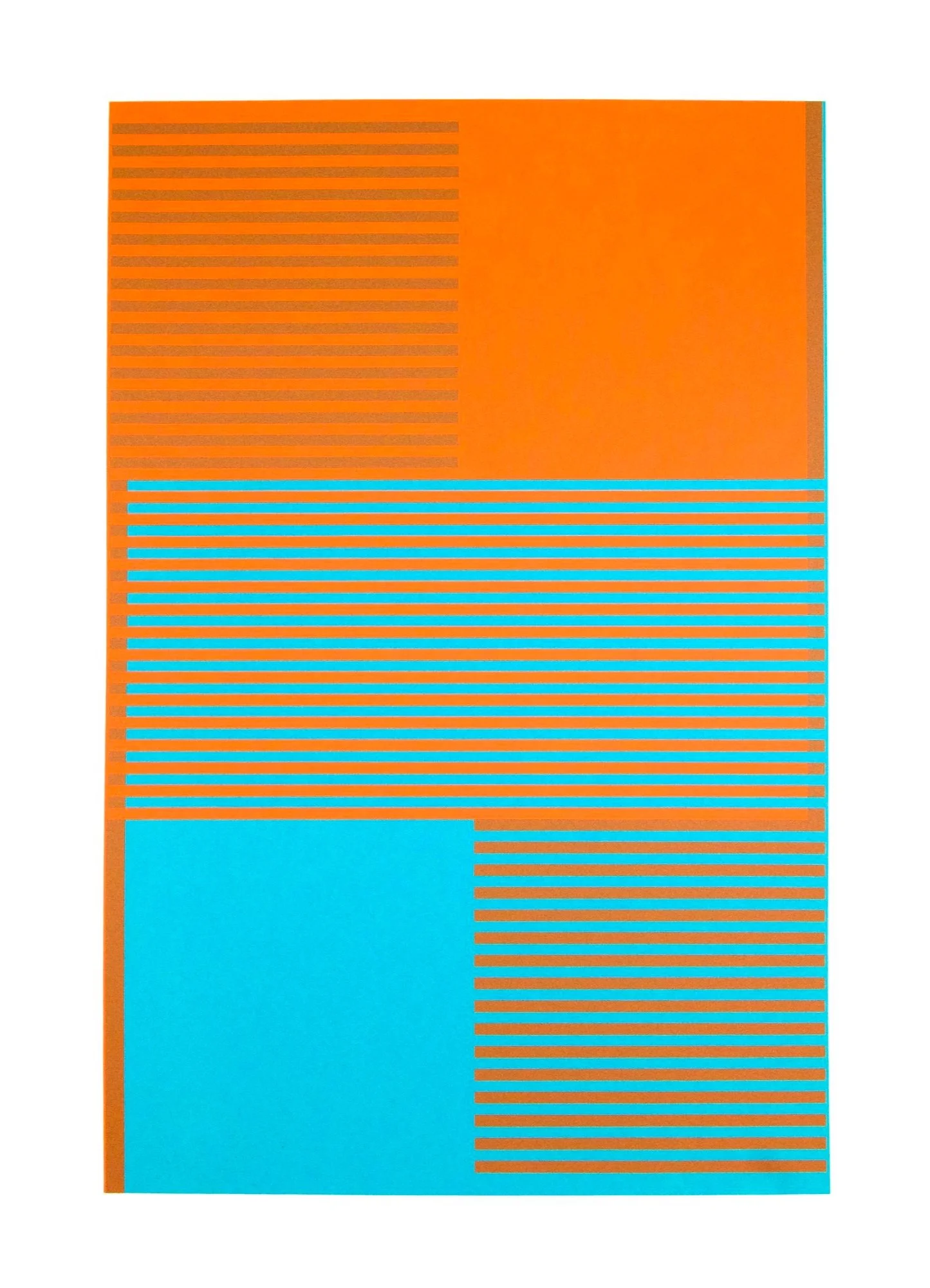
I started with colours taken directly from my ceramic collections, and focussed on exploring colour illusion and relativity, with the aim for my first collection of prints to create as many perceived colours as possible from 2 physical hues. For this I knew I could explore simultaneous contrast, where neighbouring hues create the appearance of an alternative hue, but screenprinting now offered another option, that of overlay.
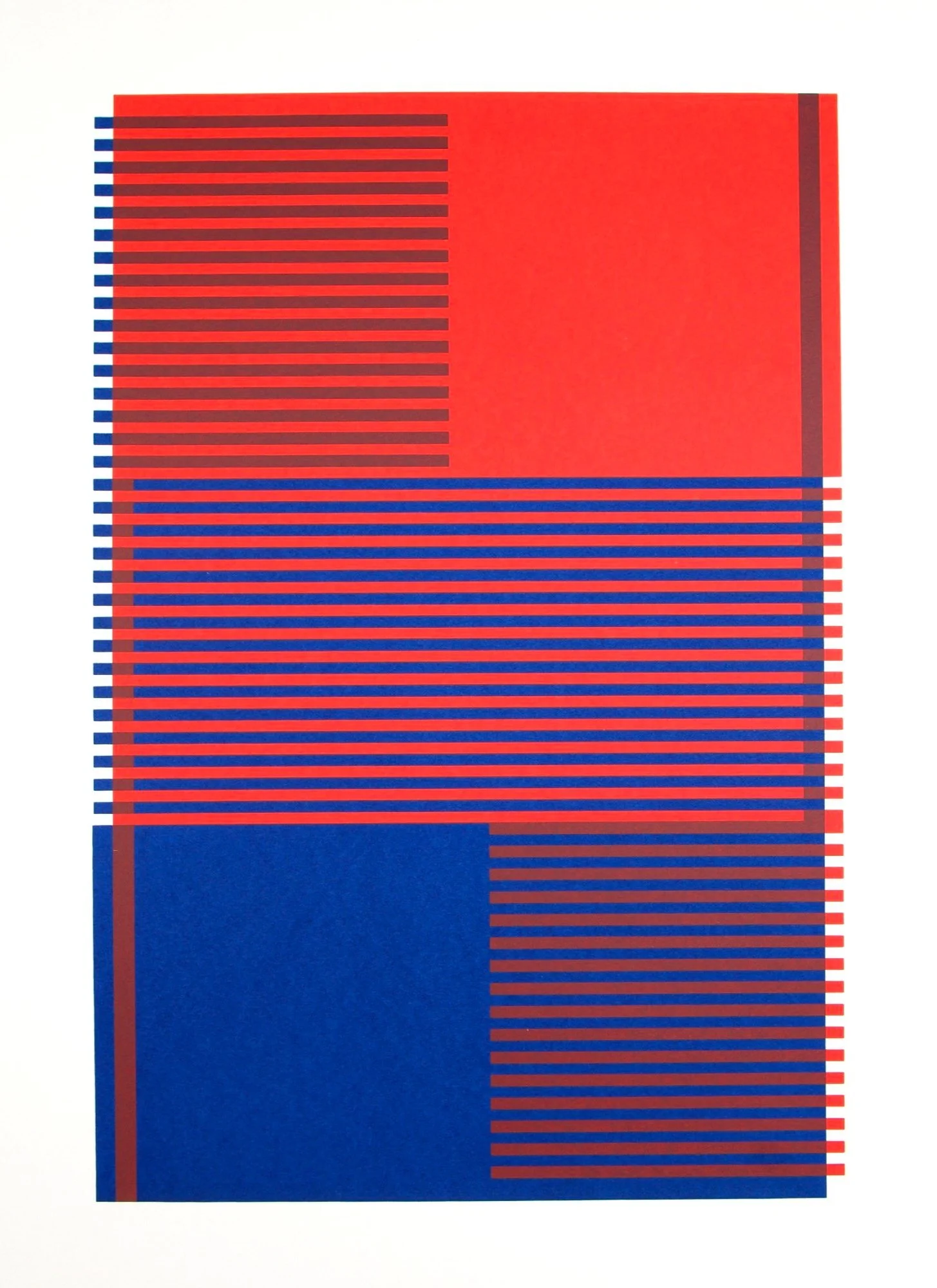
Saturn: Navy-Red 3

Saturn: Turquoise-Orange 1

Winter with Orange 1
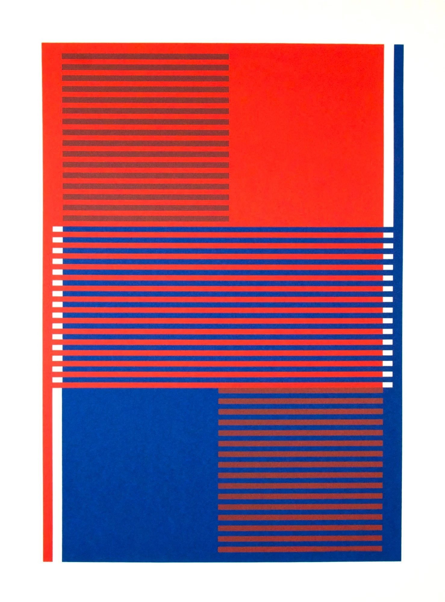
Saturn: Navy-Red 4
Saturn: Turquoise-Orange 2

Winter with Orange 2